How to Choose Brand Colors That Work Beyond the Moodboard
Choose brand colors by role, context and readability, then test the palette across digital screens, bilingual layouts and printed applications.
 Muntaser Bin KamalPublished · Updated
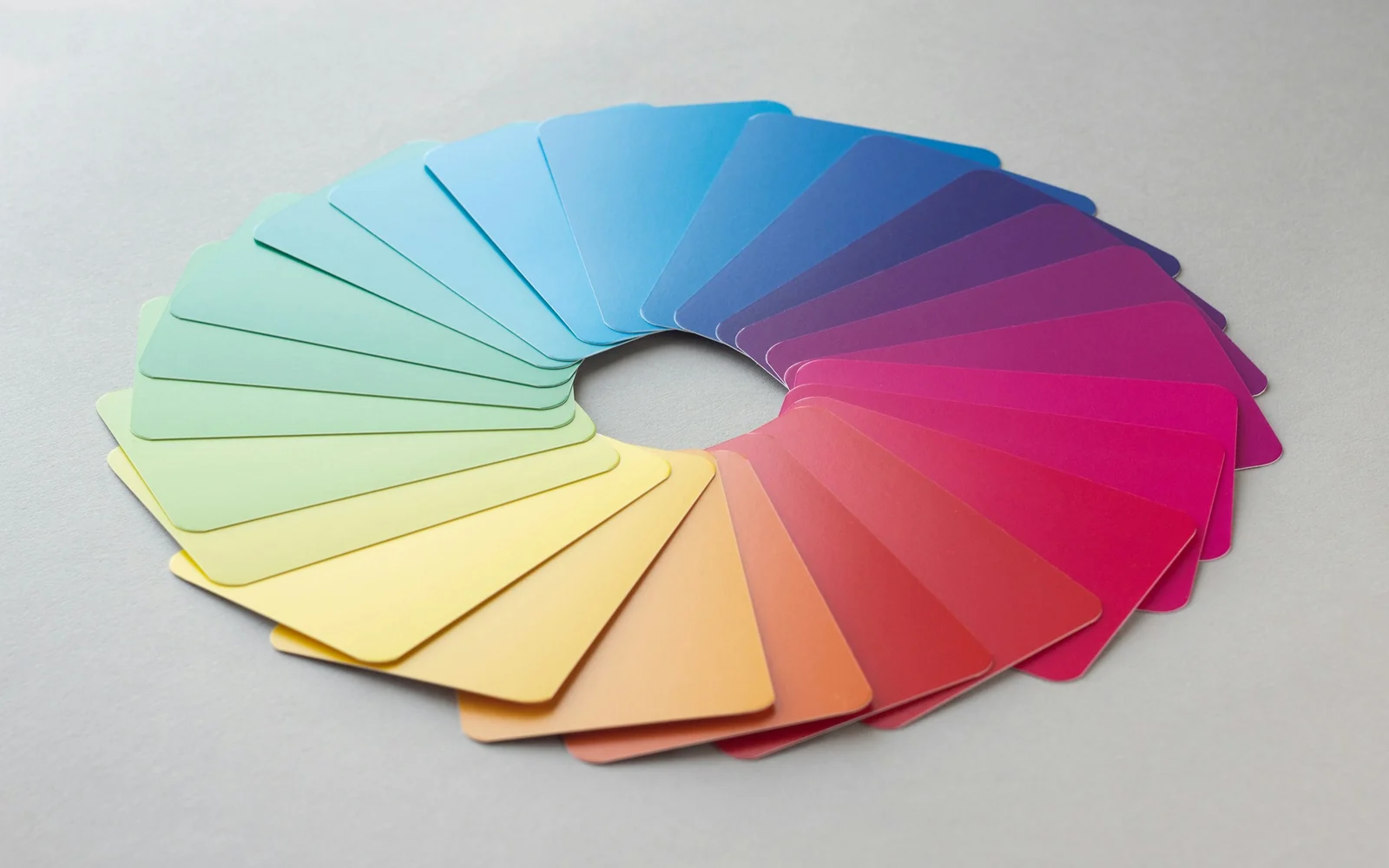
Choose brand colors by their roles in real applications, not by a moodboard alone. Test text and background pairs, product variants, photography, and print materials. Document usable combinations and exceptions. A distinctive palette still needs readable content, practical reproduction, and signals that do not depend on color alone.
- Assign each color a practical role instead of using every color everywhere.
- Check actual text and background combinations at their intended sizes.
- Validate print samples and non-color cues before wider production.
Choosing brand colors is easier when you give each color a practical job. A palette has to do more than look attractive on a moodboard. It needs to support readable content, consistent applications and the character you want the business to express.
Start with the brand context
Describe the impression you want to create and look at the category around the business. The same orange can feel energetic, warm or technical depending on the typography, imagery and materials beside it. Avoid treating a color as a universal shortcut to a particular emotion.
References are useful when you explain what attracts you to them. You may be responding to contrast, a restrained palette or a warm photographic direction, rather than to a particular color code.
Define roles before adding more colors
Choose the main backgrounds, text colors, supporting colors and accents. Show how they work together in actual compositions. A small accent can have more presence when you leave space around it instead of spreading it across every element.
A useful first test is a service page or a social carousel with real text. If the palette works only on large abstract shapes, it is not yet ready for everyday communication.
Check readability and accessibility
Text needs enough contrast against its background. WCAG 2.2 uses a minimum contrast ratio of 4.5:1 for normal text and 3:1 for large text, subject to the criterion’s definitions and exceptions. A contrast checker is more reliable than judging the combination from memory.
Do not use color as the only way to communicate a difference. Pair states, categories or product variants with understandable labels or other cues. This also helps people using the design under difficult lighting conditions.
Test Arabic and English together
If your brand is bilingual, review the same palette with both scripts. Text density, line height and the weight of the chosen fonts can affect the visual balance. A thin colored line that looks delicate in a large English heading may not work as well in a compact Arabic layout.
Use representative content rather than a single attractive word. Check mobile screens, longer paragraphs, buttons and secondary labels.
Begin with a role rather than a personality label
Color choices become more useful when you ask what the color must do. Is it identifying the brand, separating product variants, making text readable or drawing attention to an action? One color may serve several roles, but the roles need to be explicit before the palette becomes a long list of attractive swatches.
Be cautious with universal statements such as “blue creates trust” or “red increases sales.” Meaning depends on context, category, surrounding colors and the audience’s experience. Treat a proposed association as a design hypothesis to examine, not a psychological guarantee. A palette should support the particular brand and its applications rather than borrow a promise from a generic color chart.
Build relationships between colors
Define a primary role, supporting roles and neutral backgrounds. Then specify useful combinations. A bright accent may work well for a small shape but poorly as a background for long text. A neutral that looks separate on a large monitor may become difficult to distinguish on a phone in bright light.
IBM’s color guidance is a first-party example of assigning a core palette and supporting colors within a larger design language. The lesson to borrow is role and relationship, not IBM’s particular colors. Your business may need a quieter range, stronger variant separation or a different balance between product photography and graphic color.
Worked example: a dark palette with an orange accent
Imagine a hypothetical branding practice using dark surfaces, warm light text and orange. Orange might mark an action or highlight one word, while the neutral surface carries longer reading. A light panel can introduce a pricing section without requiring every section to compete at the same intensity.
Now test a product card, a long article and a small button. The same balance will not necessarily work in all three. If orange text is difficult to read at a small size, change the role or the pairing rather than insisting that every branded element use the primary accent. This is a practical design exercise, not evidence that a particular palette produces a higher conversion rate.
Check the contrast of actual text pairs
For web text, WCAG 2.2 AA generally requires at least 4.5:1 contrast for ordinary text and 3:1 for large text. In this criterion, large text means at least 18 point regular or 14 point bold, or equivalent sizing; the standard also specifies exceptions such as logotypes. Consult the W3C explanation for the definitions and scope.
Measure the foreground against its actual background, including the least favorable area when a gradient or photograph sits behind it. Check secondary text and button labels too. A pleasant hero does not excuse unreadable supporting information. Passing this one criterion is a useful check, but it does not prove that the entire interface is accessible.
Expect digital and print to need different checks
A color displayed by a screen and a color produced with ink are not the same production condition. Paper, material, finish, print process and the supplier’s workflow affect the result. Specify the digital values your team uses and agree the relevant print references with the producer rather than assuming an automatic conversion will look identical everywhere.
Review a representative proof on the intended material when the color matters to the product. Keep the approved reference and record the production assumptions. A screenshot can communicate a direction but cannot establish the physical appearance of a coating, metallic finish or textured stock. If the palette relies on those effects, the supplier conversation belongs early in the project.
Create a small palette worksheet
| Role | Specify | Test on |
|---|---|---|
| Brand accent | Intended purpose and approved pairings | Buttons, short labels, graphic shapes |
| Reading surface | Foreground and background together | Long text and small captions |
| Product variation | Color plus explicit naming | Range views and grayscale checks |
| Print reference | Supplier-agreed specification | Representative material proof |
Apply the worksheet to three priority touchpoints and record where the palette fails. Adjust the role before adding another color. Keep explicit labels for meaning so information is not communicated through color alone. Bring the results to visual identity planning with your audience, applications and production needs. The strongest palette is one the next person can use correctly, not just one that looks convincing on a moodboard.
Review the physical version
Screens emit light; printed materials reflect it. Paper, ink, finishing and the production method affect the result. Ask your supplier for a proof or sample where practical, especially when a specific appearance matters to the brand.
Document approved color values and example combinations in the brand guidelines. For a complete palette connected to your logo and applications, explore visual identity design.
Source: W3C guidance on minimum contrast.
Give the palette a real job
Assign roles before adding colors: page background, body text, primary action, supporting accent, and status messages. Write down which combinations will actually appear together, including text over photography.
Build one product card, one long paragraph, and one button at their intended sizes. Check the text pairs with a contrast tool and note the relevant font size and weight. Where color communicates a status or product variant, add a usable text label, symbol, or other cue.
View the examples on light and dark surroundings, then inspect a grayscale version to reveal lost distinctions. Grayscale inspection supplements a contrast check; it does not replace it.
For print, request a suitable sample on the intended material. Save approved pairs and forbidden uses in the guide. This proposed worksheet turns a palette into application rules without claiming universal color meanings.
Questions founders ask
Does every brand color need to contrast with every other color?
No. Evaluate the combinations you actually use and their purpose. For WCAG AA text contrast, normal text generally needs 4.5:1 and large text 3:1, subject to the criterion’s definitions and exceptions. A decorative palette swatch is not the same as body text.
Will my chosen color look identical on screen and in print?
Do not assume that. Devices, paper, ink, finishes, and production methods affect appearance. Define suitable digital and print specifications with the designer and printer, then approve an appropriate physical proof for important production work.
Sources and further reading
How this guide was prepared
Prepared with AI assistance for research, structure and drafting. Linked sources support the documented principles. Worksheets and suggested tests are editorial recommendations; numerical examples are hypothetical, not client results. No external review or measured business outcome is claimed.